Using Exploratory
Workshop recording link
Jerry's Exploratory workshop recording from the 16 September 2022 Coffee Hour
Step One: Create New Project
- Click green Create button for a new project
- Name your project as desired.
- You can later rename your project if needed.
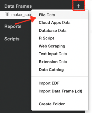
Step Two: Importing Data Frame
 Importing our data file…
- Click the + plus icon next to Data Frames
- Select…
- File Data option
- Local tab
- Excel File type
- Click the green folder menu to select our file folder
- Click Change Folder
- select the folder where you downloaded our data source
- Click the Select button
- Available data files will now appear in the select window.
- select maker_space_workshop_data.xlsx
- Click the import button
Notes on importing
Exploratory can import a wide range of sources
You can import data from local and remote data files and databases ranging from .csv and Excel, JSON and varying stats formats, mySQL to MongoDB. You can import from cloud-based apps such as Google Analytics, MailChimp, Salesforce, and Twitter. There are manual data entry options as well.
Projects can have as many data frames as desired/needed.
For instance, one data frame can be data from a survey and another can be data from LibCal reservations. After importing your data, you can then edit and massage your data — this is called "data wrangling" in Exploratory. As such, you can also have multiple data frames of the same data set, but approaching each frame with different post-import data wrangling. Let me give you an example of data wrangling…
Step Three: Data Wrangling in Summary view
Once data is selected we can double check the data came through the way we desire by looking at the Summary view dashboard.
Use the caret menu for the column alteration options
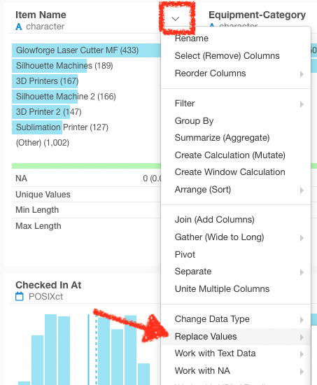 Consolidate equipment categories using the "Replace Values" option
- This allows us to consolidate the multiple 3D printers into a single equipment item for charting purposes.
- You can also use this for simple spelling issues — if a value is abbreviated in the data, but you want it spelled correctly in your charts you can correct it here.
- Click Run to execute the command, or cancel the change.
Steps
- Each time we make a change, you'll see it creates a "Step" in our far right panel.
- Steps can be activated or deactivated at any point in the future
- When creating charts or analytics you can move a pin to create charts from different points in your data wrangling process
Step Four: Charting Our Results
Bar Chart
Question: What colleges are using what equipment?
Select Bar from the Type menu
- X axis > select field Item name
- Y axis > default (Number of Rows — CNT)
- Color (Group by) > select field College
- This acts as our key and as the field for all the lines on the graph
- Filtering
- We have values where college is unavailable (former students and staff). To filter out these results...
- Click the + Filter button at the top-left corner of the chart area
- select column College > select operator Remove N/A
- Click Run
- Modifying the Chart
- Property menu
- Y Axis title text
- Axis and Group menus
- Color and Group allows you to alter spelling in Key
- Property menu
- Tabs offer preview and options for duplication and deletion
Line chart
Question: What year students are using our equipment and when?
- Select Line from the Type menu
- X axis > select Checked out at > black time scale menu Month
- This creates a timeline
- From black menu select the time scale - month is a good starting point
- Y axis > default remains as (Number of Rows — CNT)
- Again, the number of machine uses
Color (Group by) > select Year
- What students are using the makerspace and when?
- Notice NA — these are non-students and former-students - two ways to filter these NA
- Filter
- Column select Level > Operator select Remove N/A
- Column Level > Operator Equal To > Value Undergraduate or Graduate
Modifying the Chart
- Property menu
- Y Axis title text
- Axis and Group menus
- Color and Group allows you to alter spelling in Key
- Tabs offer preview and options for duplication and deletion
Step Five: Share Your Results
Happily, Exploratory also gives you tools for reporting out your findings. The most flexible of which is what I call the data notebook.
-
Reports > Plus icon
- Note
-
The left panel is a markdown-based word processor.
- Whenever you insert a heading, the navigation bar automatically inserts a link to that section of the report.
- Using the toolbar at the top of the word processor, you can also create links and insert images.
- The key aspect is adding the charts we've just created — click the chart button highlighted in a red box below.
- Hover over the other tools to discover the other options!
- Click the green Run button to preview your page!
- Make any edits needed and click Run again.
- Click the Publish button above the Preview panel.
-
This publishes your Note to Exploratory's servers and provides a sharable link.
- You get 500MB of storage free— enough for two or three good-sized reports. If you get into creating a lot of reports, I can show you how to save your reports to Github Pages or other free online hosting.
